
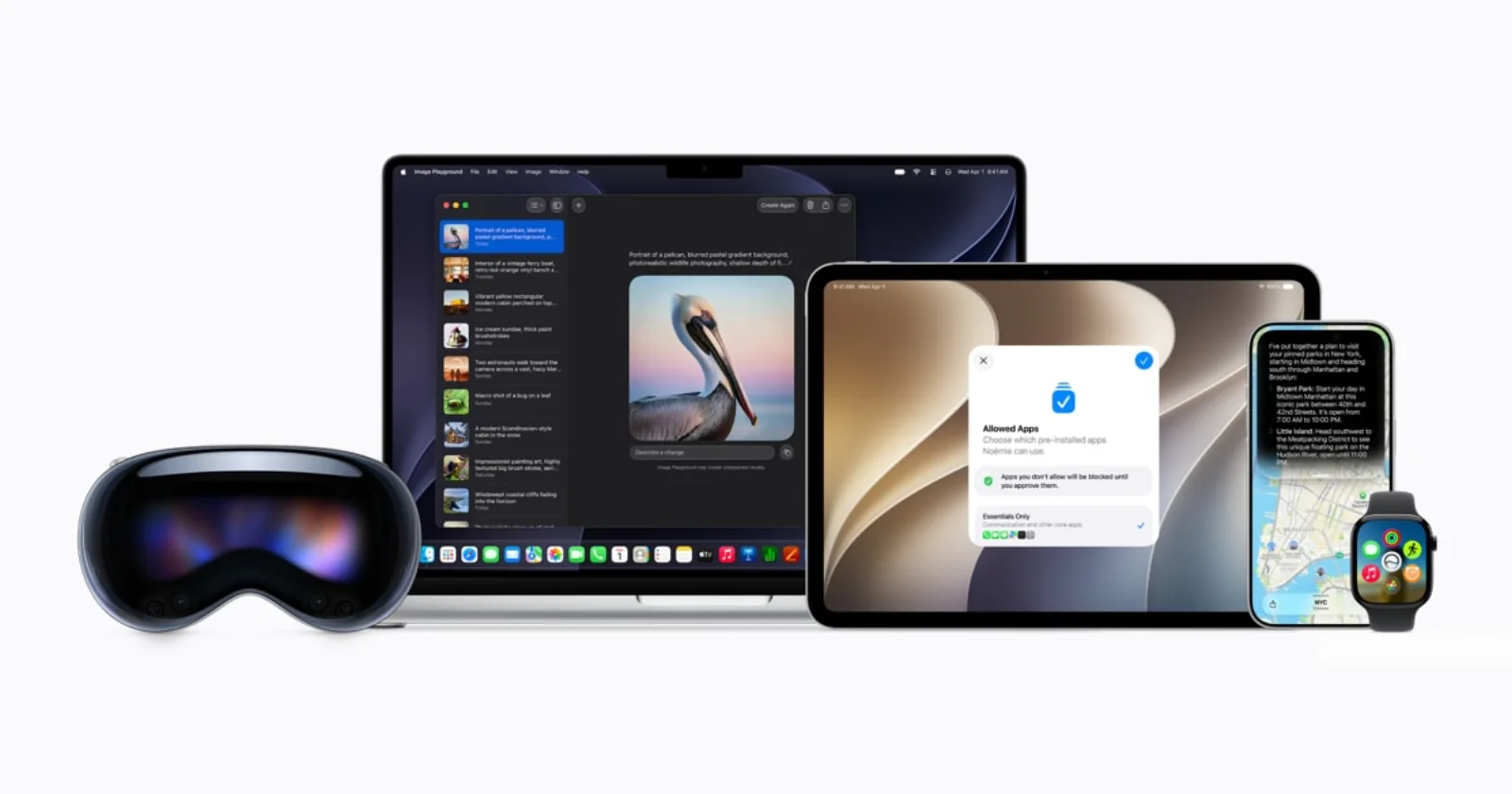
Apple previewed its 2027 software releases at WWDC26 on June 8, combining a new generation of Apple Intelligence with interface and performance refinements across iPhone, iPad, Mac, Apple Watch, Apple Vision Pro, and Apple TV.
For designers, the most relevant change is Apple’s continued adjustment of Liquid Glass. A new system control lets people move the material from very clear to fully tinted, giving users more influence over contrast and visual density.
A more adjustable visual system
Apple says app icons have been sharpened and refined. On Mac, the release restores familiar platform characteristics including a more uniform toolbar, edge-to-edge sidebars, and colored sidebar icons.
These changes suggest that Apple is treating its visual language as a system that can evolve after launch. Transparency and depth can create hierarchy, but they need tuning for readability, context, and personal preference.
Performance is part of interface quality
The company also emphasized faster app launches, photo loading, AirDrop transfers, storage browsing, and more stable search. Those improvements matter to design because responsiveness affects how every transition and control feels.
A beautiful interface that hesitates or loses state is not a polished experience. Apple’s announcement places reliability, speed, and visual refinement inside the same product-quality story.
The broader design lesson
System-level materials need room for accessibility and user control. The Liquid Glass slider acknowledges that one visual treatment cannot serve every environment or preference equally well.
The strongest part of the update is not a single effect. It is the willingness to refine the system after observing how it behaves across many products, screen sizes, content types, and real-world conditions.