Complete guide
Every page of the final brand book is presented in its original sequence.
A complete identity system that turns AnyLingo's promise of effortless communication into a clear, playful, and adaptable brand.
What we made, why it mattered, and how it came together.
AnyLingo is designed to make communication effortless, no matter the language. The brand puts immediate connection first while making learning a natural part of every conversation.
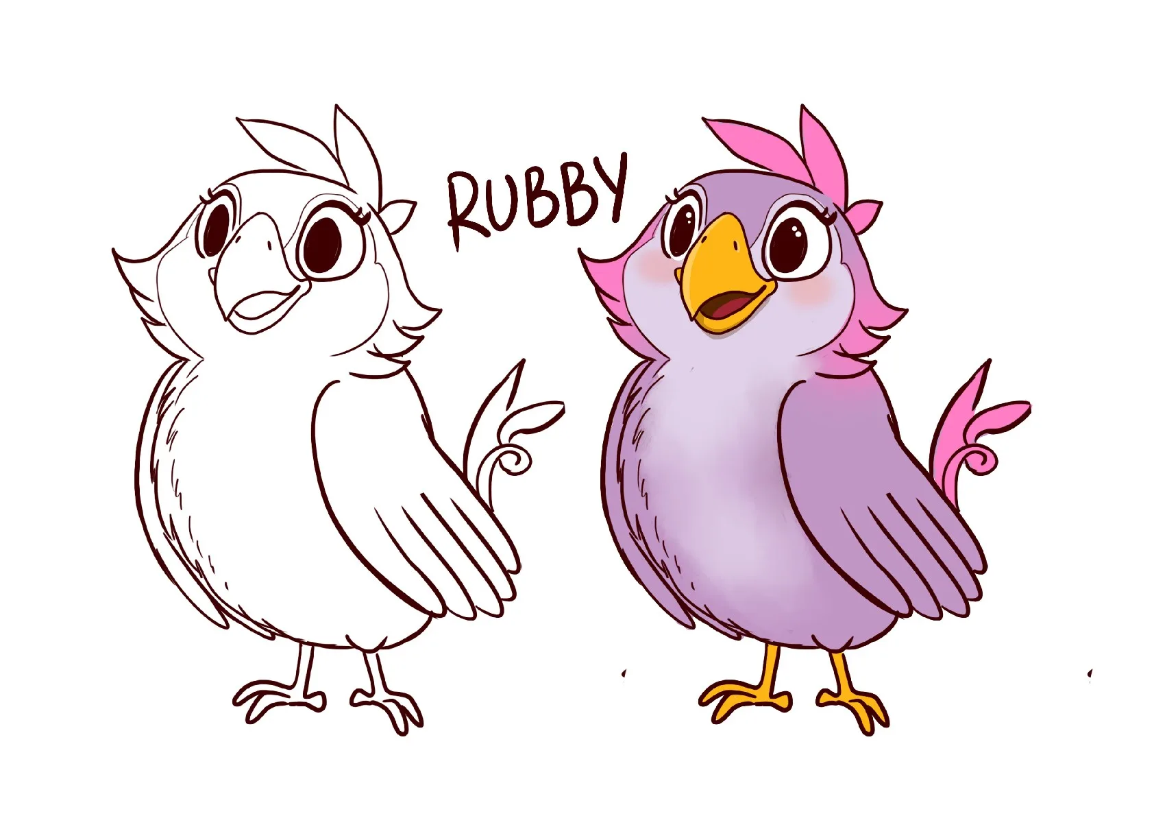
The identity centers on a parrot, a symbol of listening, adapting, speaking, and learning. Its colorful personality reflects the diversity of human expression and gives the product an approachable face.
The completed 20-page brand book defines the story, logo variations, spacing, icon usage, color system, typography, merchandise, outdoor advertising, and stationery in one consistent guide.
Every page of the final brand book is presented in its original sequence.
Horizontal and vertical lockups keep the identity balanced across different spaces.
Green, yellow, orange, signature grey, and white define the primary brand system.
Feather Bold leads headings while DIN Next Rounded supports readable body copy.
AnyLingo needed to stay friendly and expressive while working at very different scales, from an app icon and business card to merchandise and a full outdoor billboard.
The system also needed to explain how each asset should be selected and spaced so future applications would remain consistent without feeling rigid.
What we had to balance
Playful character versus professional clarity
Flexible logo formats versus consistent recognition
Bright primary color versus reliable contrast
Expressive illustration color versus a controlled core palette
Digital icon scale versus large-format advertising
Our approach
The parrot captures AnyLingo's central idea: listen, absorb, adapt, and speak with confidence. Its silhouette and colors create recognition before any supporting message is read.
A compact set of logo, color, type, spacing, icon, and application rules lets the same identity move from product screens to physical materials without losing its meaning.
People who need to understand the product, its tone, and its core value quickly.
People who expect the brand to feel familiar across chat, translation, learning, support, and account settings.
Design and product teams that need clear assets, active styles, contrast rules, and motion guidance.
People creating stories, campaigns, and multilingual content from a shared visual foundation.
Frame AnyLingo around effortless connection first and natural learning through conversation.
Use the parrot to express listening, language, adaptability, curiosity, and confidence.
Design horizontal and vertical variations with documented spacing for different environments.
Define the five core colors, gradients, illustration spectrum, and typography pairing.
Apply the identity to icons, merchandise, outdoor advertising, business cards, and stationery.
Bring the complete system together in a clear 20-page brand book for future use.
Each feature supports the wider experience instead of standing on its own.
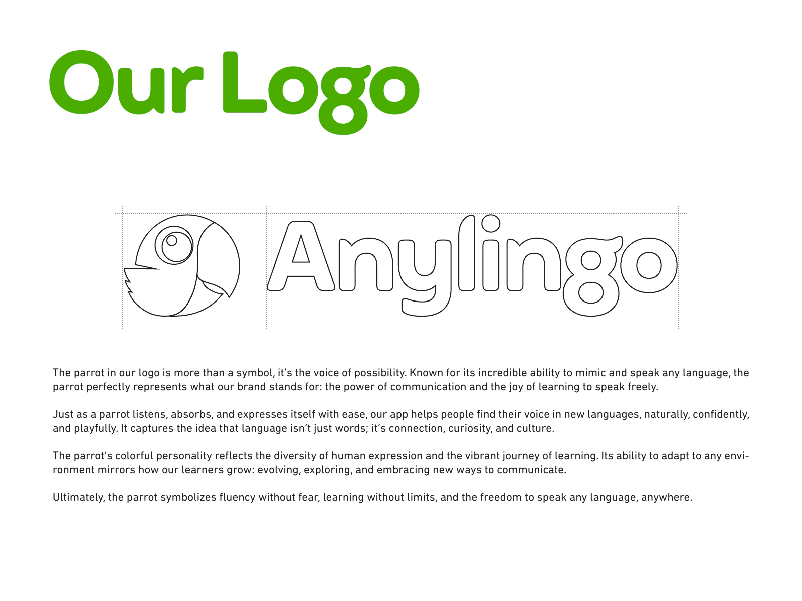
The parrot and wordmark create a distinctive symbol for communication, adaptation, and learning.
A bright primary green is supported by yellow, orange, signature grey, white, and approved gradients.
A simple two-typeface system keeps the brand confident, modern, approachable, and readable.
Illustrations can use a vibrant spectrum while merchandise keeps a white base for reliable logo clarity.
The system is demonstrated in realistic formats so future work can follow a clear visual precedent.
Key decisions
DecisionBuild recognition around a character associated with listening, mimicry, language, and expression.
ReasonThe idea connects directly to AnyLingo's promise of speaking freely and learning naturally.
DecisionProvide horizontal and vertical lockups instead of forcing one composition into every space.
ReasonBoth formats preserve balance and legibility across different products and layouts.
DecisionUse white as the base color for branded merchandise.
ReasonThe logo remains clear while the item format can determine the best lockup orientation.
DecisionSet Feather Bold for titles and DIN Next Rounded for body copy.
ReasonThe pairing creates strong hierarchy while keeping longer text approachable and easy to read.
DecisionAllow a full spectrum of tints and shades for illustrations while keeping the core brand palette fixed.
ReasonCharacters stay playful and varied without weakening brand recognition.
Mark craft
The circular parrot, large eye, green feathers, yellow beak, and orange accent stay distinctive from a small icon to a full-page brand moment.
Logo construction
Horizontal and vertical compositions give the identity room to adapt while documented clear space protects the relationship between symbol and wordmark.
Application design
Merchandise, advertising, business cards, letterhead, notebooks, and envelopes show how the core elements work beyond a guideline page.
Logo consistency
The horizontal and vertical variations maintain the same recognizable relationship between the parrot and the AnyLingo name.
Color control
Five approved colors and two gradients provide enough range for brand work while keeping the primary green unmistakable.
Typography consistency
Feather Bold creates confident titles while DIN Next Rounded keeps supporting explanations readable and approachable.
Brand principle
AnyLingo puts connection first. It combines instant communication, pronunciation support, and language learning so every conversation can become a natural step toward fluency.
Brand artwork
The parrot represents the power of communication and the joy of learning to speak freely. Its adaptable, colorful character expresses curiosity, culture, confidence, and the freedom to speak any language anywhere.
#4AAD00The core brand color used for recognition, energy, and large signature fields.
#FFC807A bright secondary color drawn from the parrot and used in supporting gradients.
#E56628A warm secondary accent for the parrot and expressive brand moments.
#232221The dark neutral for text, icons, and high-contrast applications.
#FFFFFFThe primary light surface and the approved base color for merchandise.
The primary typeface for headings and titles across digital and print applications.
Speak freely. Learn naturally.
The secondary typeface for body text and paragraphs, chosen for clear and approachable reading.
Learning is part of the conversation.
Voice
Imagery
Applications
Avoid
When the identity moves, preserve the logo proportions, keep transitions clear, and let the message remain understandable without animation.
Screens and design details from the project, with a short note about each view.
The complete AnyLingo Brand Book cover.
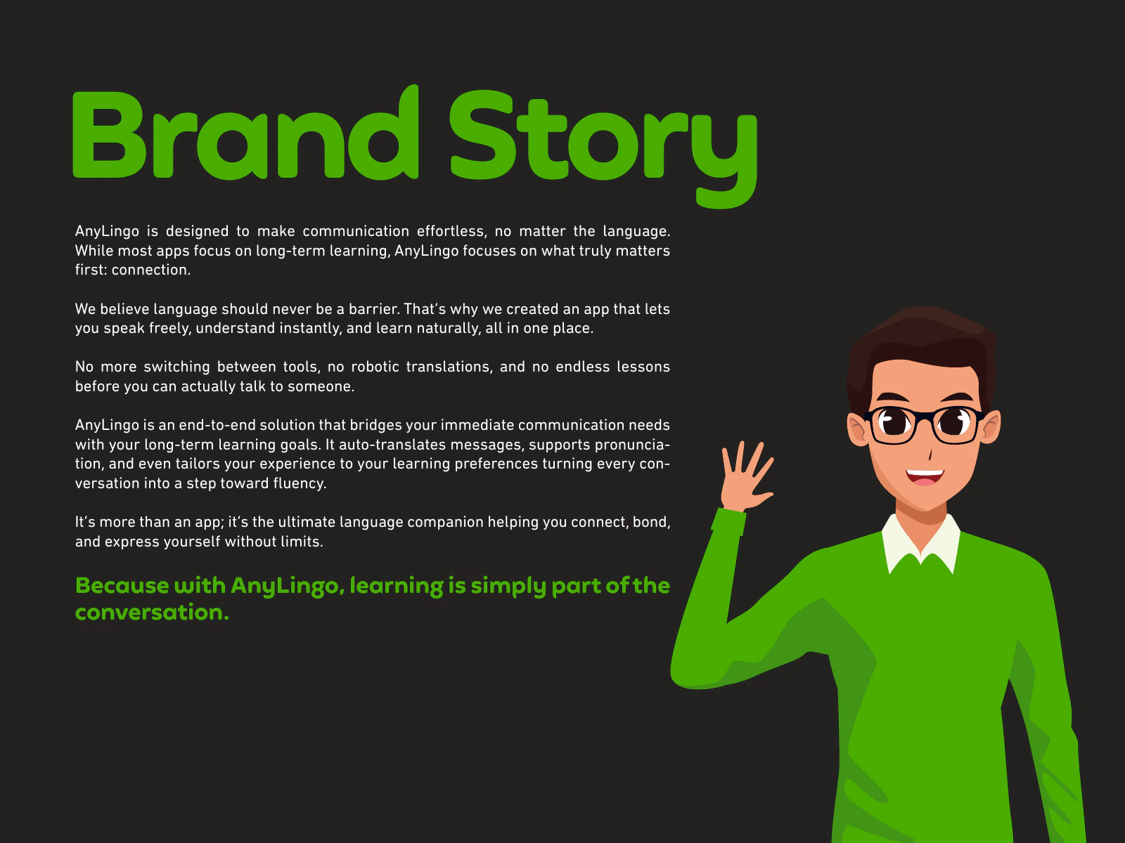
The brand story puts effortless connection first and makes learning part of the conversation.
The parrot represents communication, curiosity, adaptability, and the freedom to speak.
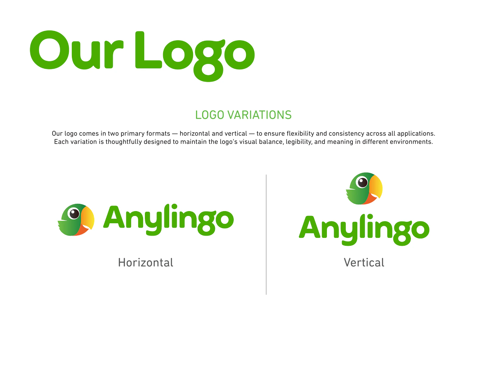
Horizontal and vertical logo variations provide flexibility across different applications.
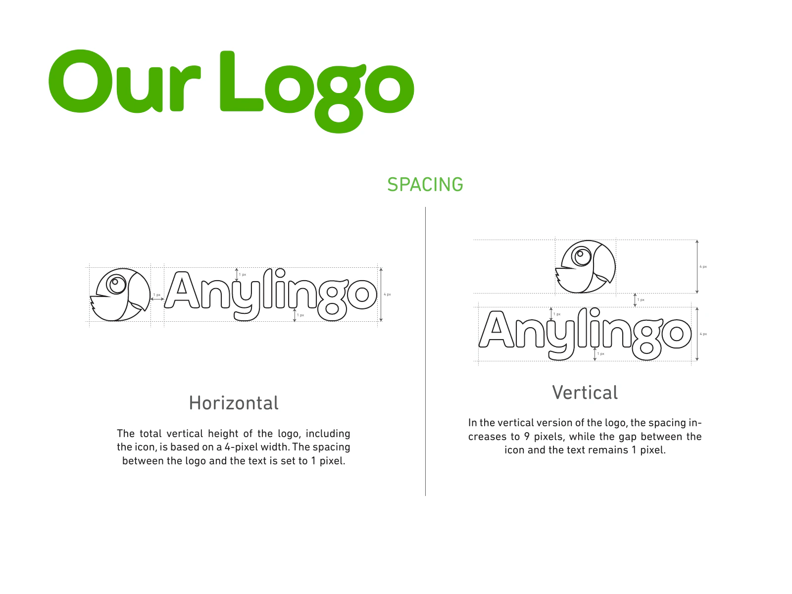
Logo spacing rules protect the relationship between the parrot and wordmark.
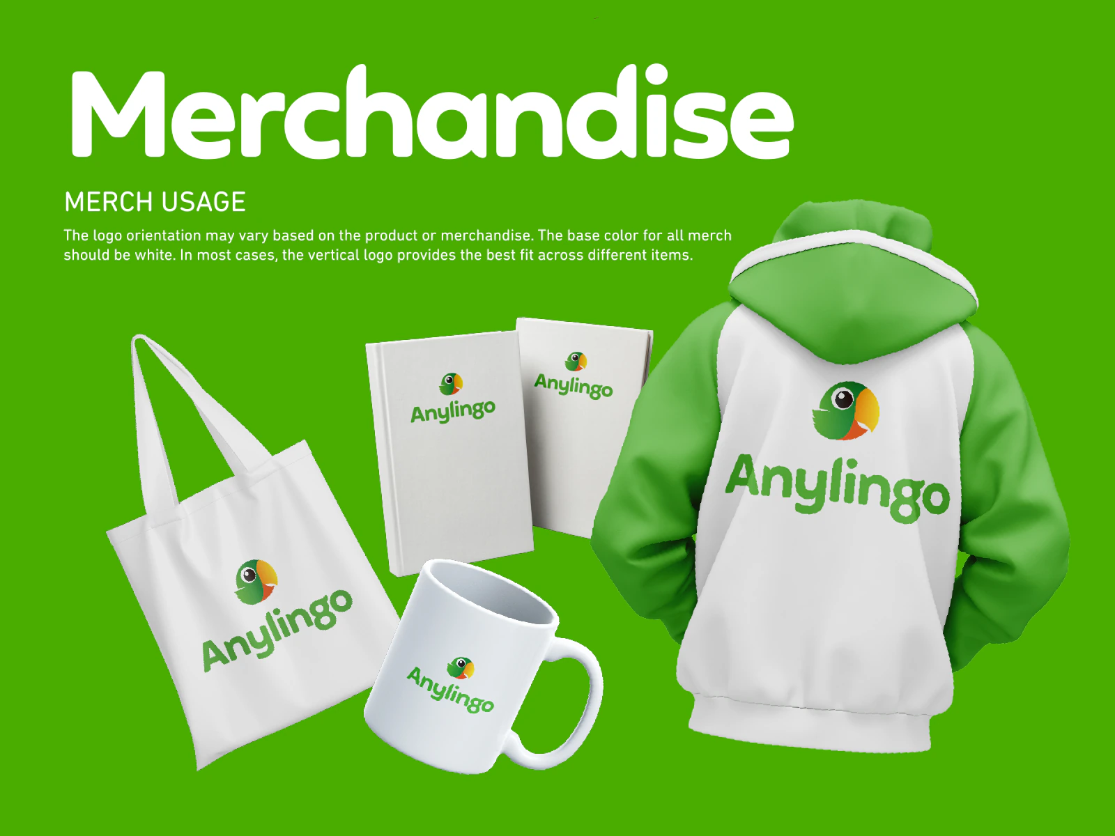
White-base merchandise demonstrates the logo across bags, notebooks, mugs, and clothing.
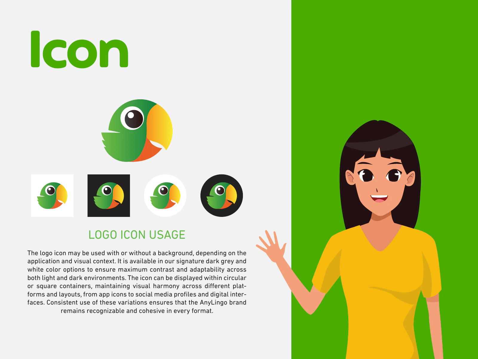
Icon guidance covers light and dark treatments plus circular and square containers.
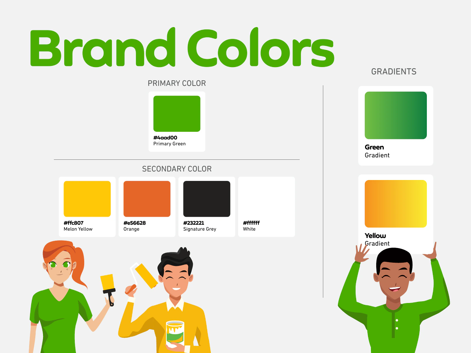
The core palette defines Primary Green, Melon Yellow, Orange, Signature Grey, White, and gradients.
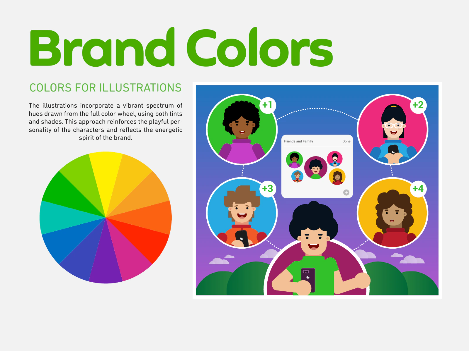
Illustrations use a vibrant spectrum of tints and shades for playful character work.
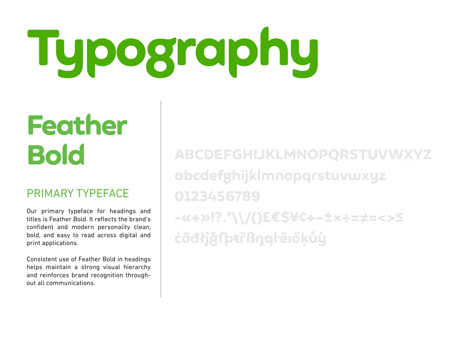
Feather Bold is the primary typeface for confident headings and titles.
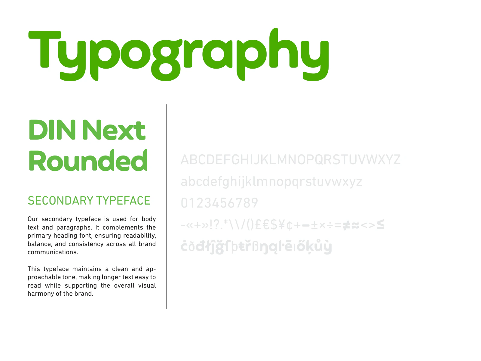
DIN Next Rounded is the secondary typeface for readable body copy and paragraphs.
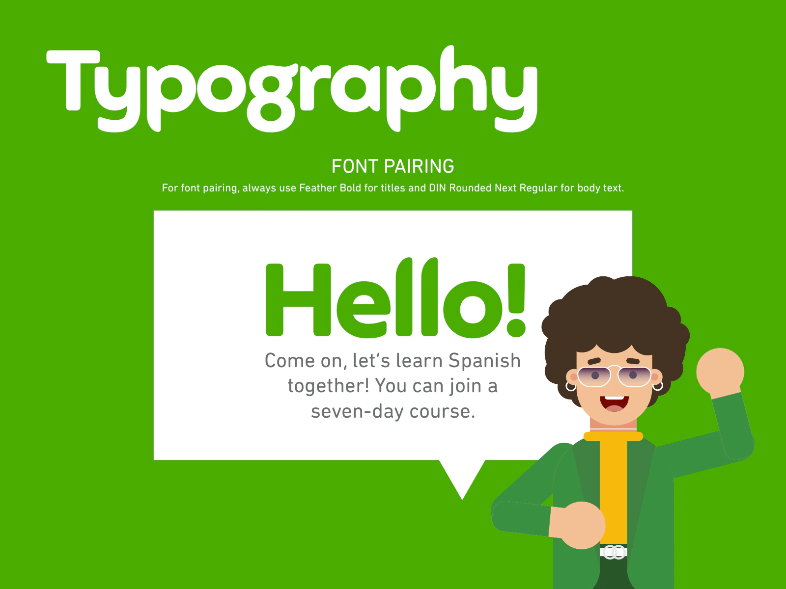
The approved pairing uses Feather Bold for titles and DIN Next Rounded for body text.
The outdoor advertising section introduces the large-format application system.
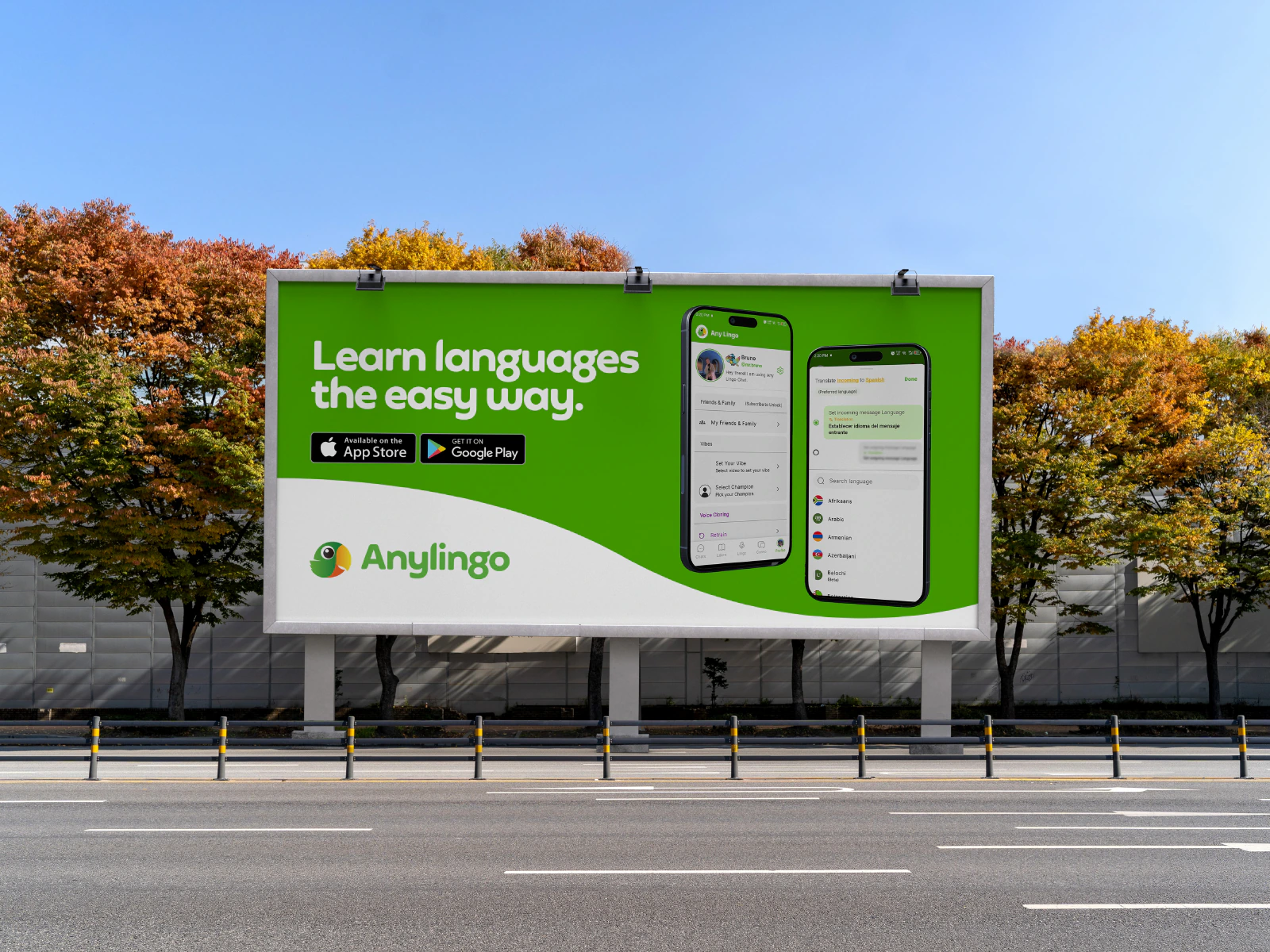
A roadside billboard combines the campaign message, product screens, store badges, and logo.
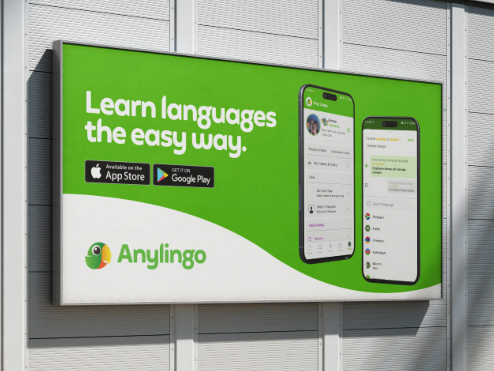
A wall-mounted billboard shows the same outdoor layout in a compact setting.
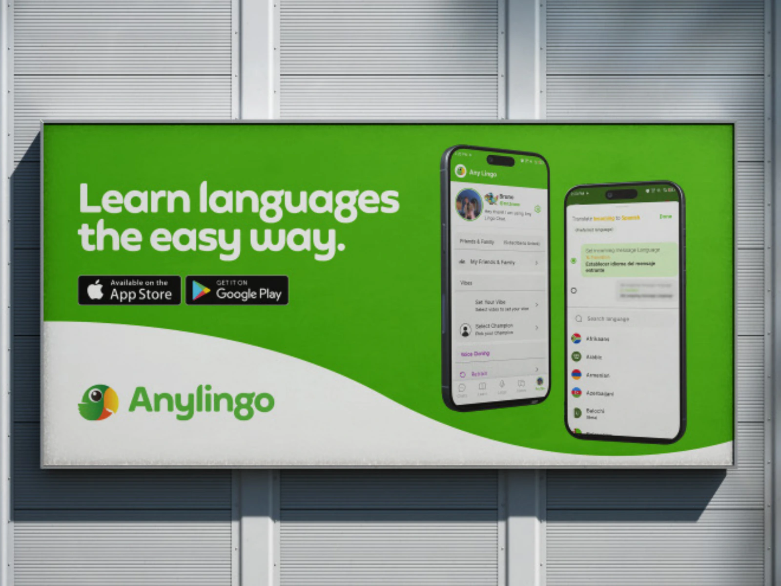
A wide building-mounted billboard tests the campaign at another real-world scale.
The stationery section introduces the print application system.
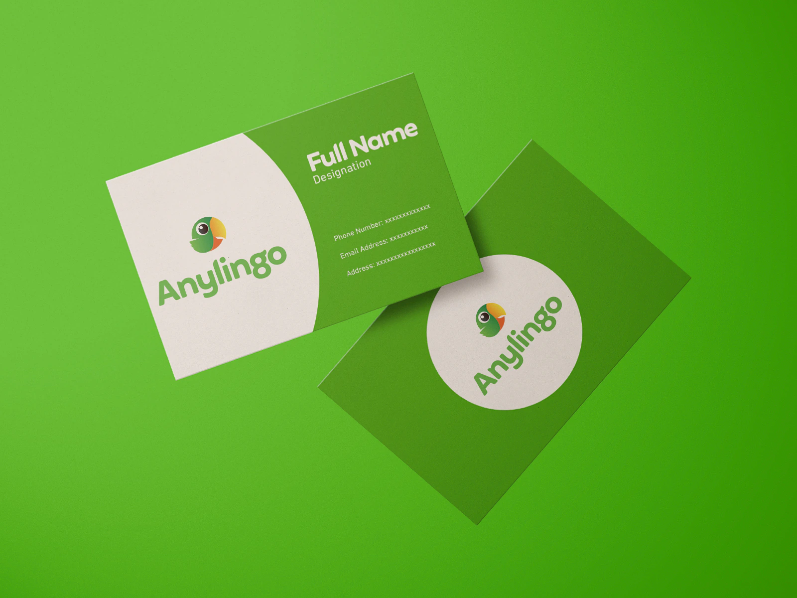
Business card mockups apply the parrot, wordmark, green field, and white shapes.
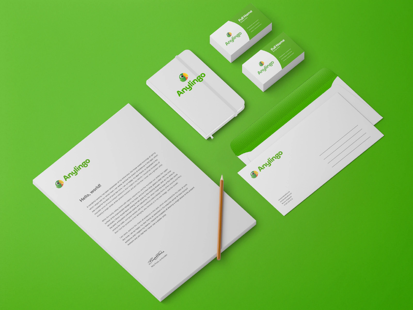
The stationery suite brings the identity to letterhead, notebooks, business cards, and envelopes.

The final page closes the complete AnyLingo Brand Book.
The final 20-page brand book gives AnyLingo one clear story and a practical visual system built around the parrot, primary green, supporting colors, and a two-typeface hierarchy.
The work shows both the rules and the results. Teams can choose the correct logo, spacing, icon, color, and type treatment, then see how the system behaves on merchandise, billboards, business cards, and stationery.
What we delivered
Start a project
Share the product, the current stage, and the support you need. We will reply with practical next steps.
Start a project