
Market list
Prices and movement follow a stable layout that is easy to compare.
A clearer way to move from a market overview to one asset in detail.
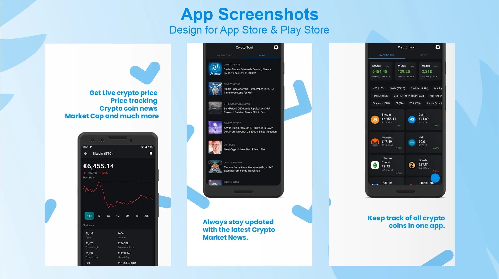
What we made, why it mattered, and how it came together.
Crypto Tool brings cryptocurrency prices, charts, market details, and news into one mobile app.
We designed the interface for two different moments: quickly scanning the market and slowing down to review one asset.
Prices and movement follow a stable layout that is easy to compare.
The selected asset gets more room for its chart and key details.
People can review movement over different periods.
Related reading stays close without crowding the price data.
People need to compare several assets quickly, then inspect the chart and details for one of them.
The small screen had to support both without making every number look equally important.
What we had to balance
Quick scanning and deeper research
Current movement and longer history
Dense data and comfortable touch targets
A dark theme and strong contrast
Our approach
The market list uses repeated rows and aligned values for comparison. The asset page changes pace, giving the price and chart more space before showing the supporting details.
Time controls and consistent movement labels help people change context without learning a new layout.
Scan prices and movement across several assets.
Review its chart, time ranges, and supporting details.
Use related articles for more context.
Compare assets using a stable list.
Open the currency that needs a closer look.
Confirm the name, price, and movement.
Review the chart over a useful period.
Move into supporting market information.
Add context and return easily to the asset.
Each feature supports the wider experience instead of standing on its own.
Repeated rows make prices and movement easier to compare.
The selected currency, price, and chart receive clear priority.
Simple options change the chart without hiding the active period.
News cards use a different rhythm so articles do not look like price data.
Key decisions
DecisionKeep prices and changes on stable columns.
ReasonPeople can spot differences without rereading each row.
DecisionUse shape, text, and contrast for the selected chart range.
ReasonA chart is hard to understand when the time range is unclear.
DecisionPair positive and negative colors with signs and numbers.
ReasonMovement should remain clear for everyone.
Numbers
Alignment and consistent formatting make changing prices easier to scan.
Dark interface
Layered surfaces and limited accent colors keep the hierarchy readable.
Charts
Time range, current value, direction, and supporting details sit close to the line.
Components
Rows, charts, periods, details, and news cards are designed for changing names, values, and states.
Clarity
The app organizes market information and keeps time ranges clear without turning the interface into financial advice.
Screens and design details from the project, with a short note about each view.
The market list, asset chart, details, and news form one connected reading flow.
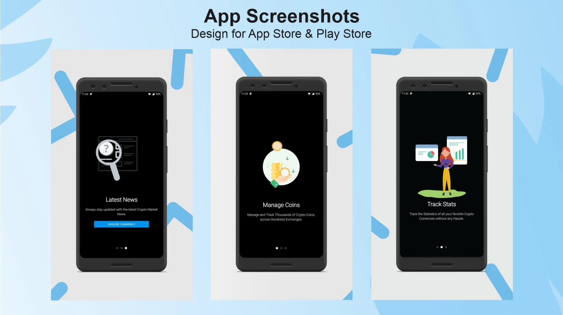
Asset pages place price movement and time range before supporting information.
The design moves naturally from a broad market list to a focused asset page, with charts, supporting details, and news arranged in a clear order.
What we delivered
Start a project
Share the product, the current stage, and the support you need. We will reply with practical next steps.
Start a project