
Starting point
Beginner material gives new learners a clear first step.
Making a complex subject easier to start and easier to continue.

What we made, why it mattered, and how it came together.
Meta Forex is a learning app for people who want to understand foreign-exchange markets. We organized courses, chapters, lessons, progress, search, and articles into one focused mobile experience.
The design gives beginners a clear place to start and helps returning learners pick up where they left off.
Beginner material gives new learners a clear first step.
Lessons are grouped into courses and chapters that are easy to scan.
Learners can see where they stopped and what comes next.
Courses and supporting articles are easy to find.
New learners face unfamiliar terms, long courses, and a large amount of market information.
The app needed to feel serious without becoming intimidating, and structured without feeling rigid.
What we had to balance
Expert ideas and beginner language
A large library and a clear path
A dark visual style and easy reading
Visible progress and realistic expectations
Our approach
Course cards explain the topic and level. Course pages show the chapters before someone starts, and progress helps them return to the right lesson.
Articles sit beside the learning path without distracting from the next course or lesson.
Need a clear starting point and manageable lessons.
Need to resume the right course and lesson quickly.
Need search when they arrive with a specific question.
Home shows beginner paths, current courses, and topics.
Search or categories lead to a useful course.
See the topic, level, chapters, and lesson structure.
Open the next lesson without guessing where to go.
Read lessons in a focused view with the chapter still clear.
See what is complete and what remains.
Each feature supports the wider experience instead of standing on its own.
Home balances a clear starting point, current progress, and broader discovery.
Cards show enough information to choose a suitable course.
Courses, chapters, and lessons follow a pattern learners can understand quickly.
Supporting reading is easy to find but remains separate from the main course path.
Key decisions
DecisionKeep courses and progress at the center of the app.
ReasonPeople came to learn, not to chase noisy market signals.
DecisionLet learners see the chapters before they begin.
ReasonThey can understand the commitment and choose with more confidence.
DecisionUse clear contrast, spacing, and restrained accent colors.
ReasonLong reading sessions should still feel comfortable.
Hierarchy
Courses, chapters, lessons, and articles use different layouts so learners know what they are opening.
Progress
Progress sits beside the course structure so it guides the learner instead of acting like a score.
Reading
Comfortable spacing, short line lengths, and strong contrast support focused reading on a phone.
Content structure
Courses, chapters, lessons, progress, and articles follow a reusable content model.
Responsibility
The experience teaches market ideas without promising results or presenting lessons as trading signals.
Screens and design details from the project, with a short note about each view.
Home brings together search, beginner guidance, current progress, and course discovery.
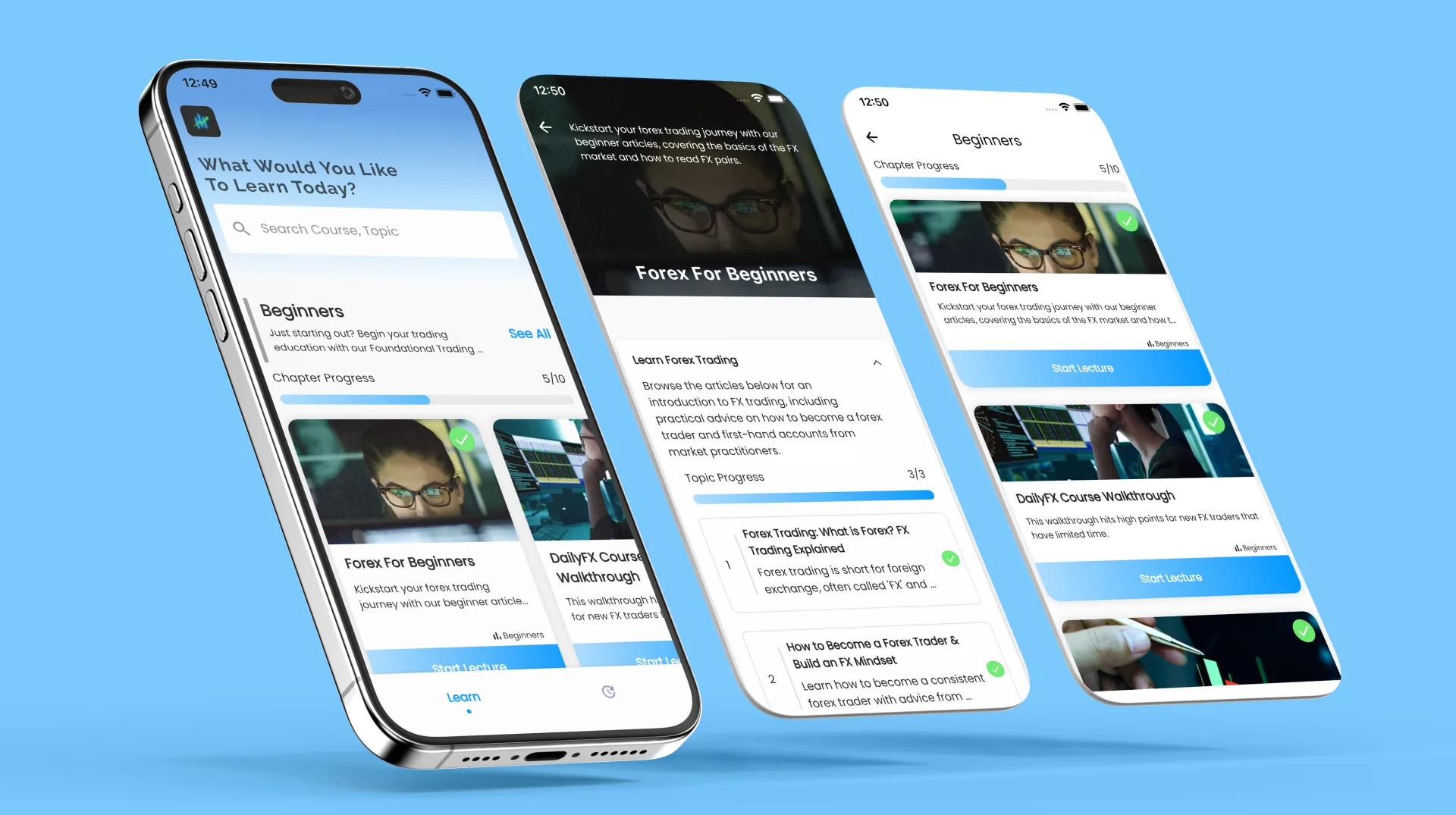
Course and chapter screens show the path before a learner continues.

Lesson and article views support focused reading in the same dark interface.
Meta Forex gives learners a clear beginning, a visible course structure, and an easy way to continue. Supporting articles add context without taking over the learning experience.
What we delivered
Start a project
Share the product, the current stage, and the support you need. We will reply with practical next steps.
Start a project