Readable by default
Names, roles, contact details, and links remain useful when images are hidden or unavailable.
A visual email signature builder that gives people creative control and still works well in the inbox.
What we made, why it mattered, and how it came together.
Signlume brings names, roles, contact details, links, portraits, logos, and brand styling into one clear workflow. People can choose a design, make it their own, review it, publish it, and follow a guided installation.
Email is an unpredictable place for design. Different apps can change layouts, block images, adjust colors, and handle motion in different ways. Signlume solves this by keeping the rich editing experience separate from the simpler version that goes into an email client.
The result keeps the important parts useful. Names and contact details stay as live text, links remain clickable, motion is optional, and every signature has static and plain-text alternatives.
Names, roles, contact details, and links remain useful when images are hidden or unavailable.
A published signature keeps its chosen design, even when new templates join the catalogue.
Animation adds personality without becoming necessary for reading or using the signature.
Clear steps help people add a signature to their email app and check it with a real message.
A signature has only a few seconds to introduce someone. It also has to survive email apps that disagree about layout, images, fonts, animation, and dark mode.
The product needed to work for a person making one signature and for a team managing many. Both should feel simple, but teams also need shared designs, clear roles, ownership, and a clear history.
The challenge was to make editing feel open and creative while keeping the installed result small, stable, and easy to restore.
What we had to balance
Creative layouts versus email limits
Motion versus quick readability
Freedom to edit versus a consistent email result
Personal style versus team consistency
Useful reporting versus recipient privacy
A growing catalogue versus stable published work
Our approach
Signlume keeps the editable design separate from the email-ready result. The editor can offer layers, sections, image controls, previews, and recovery without expecting an inbox to behave like a browser.
Each signature stays connected to the design version it started with. New catalogue releases do not quietly change work that has already been published.
Preview modes show common email conditions, checks flag likely problems, installation ends with a real-message checklist, and reporting is shown as an estimate rather than a confirmed open.
People who want a polished signature without learning email code. They can start from a design, update their details, review the result, and follow clear installation steps.
Teams that need shared standards, clear ownership, reusable designs, clear access, and a history of what was published.
People managing several identities who need repeatable setup, flexible media, consistent results, and designs that do not change unexpectedly.
Search and filter designs by category, access, and motion, then open a full preview before choosing one.
Start with the sample design, saved profile details, manual entry, or an empty draft.
Add names, roles, company information, contact details, links, portraits, logos, calls to action, and legal notes as separate elements.
Arrange layers, insert sections, manage images and brand settings, and use undo, redo, shortcuts, and recovery while working.
Check the design in narrow, dark, images-off, plain-text, and email-focused views before publishing.
Review compatibility and size, save the design, and publish an email-ready version with a plain-text fallback.
Follow the setup guide, send a real test email, and return to earlier versions when needed.
Each feature supports the wider experience instead of standing on its own.
The library helps people find a design that fits their role, content, and visual style.
The editor keeps complex design choices understandable through direct controls and a clear structure.
Publishing turns the richer design into compact code made for common email clients.
Image controls use the space available in the chosen design, so crops and placement stay consistent.
Roles and ownership keep shared work organized without taking away each person’s identity.
Reporting shows overall activity without tracking individual recipients.
Key decisions
DecisionKeep the editable design separate from the version installed in an email client.
ReasonThe editor can stay flexible while the final signature stays simple and consistent.
DecisionBuild names, roles, contact details, links, and legal text as real elements instead of one flat image.
ReasonThe signature stays readable, selectable, clickable, and useful when images are blocked.
DecisionSave the chosen design and installed result for each published version.
ReasonNew catalogue updates cannot change an existing signature without the owner choosing to update it.
DecisionUse one short animation with a complete start and finish, plus static and plain-text alternatives.
ReasonMotion can add personality without distracting the reader or hiding important information.
Identity
The Lume Stroke draws the letter S as one signature-like gesture and finishes with a bright point. The custom wordmark carries the same movement across the Signlume name.
Composition
Large type, numbered markers, fine rules, square buttons, and warm paper tones give the public site a strong rhythm. Inside the product, the same ideas become tighter grids, quieter backgrounds, and clearer controls.
Interaction
Reveals, movement, scale, and video help guide attention. They pause when hidden, respond to device preferences, and never replace the content itself.
Imagery
Opal forms, refracted glass, bright color, portraits, workspaces, and product screens show identity moving through different environments.
A real 60 fps screen recording of the current public site, using the opening six seconds to move from the Lume identity into the homepage product story.
Rendering
The editor works from one design while producing separate previews and an email-ready result. The same layout rules keep those views aligned without treating an inbox like a full web browser.
Preview safety
Imported signature code opens in a separate preview window. It cannot run scripts, open popups, submit forms, or take over the product page.
Media placement
Before an image is cropped, zoomed, or tiled, Signlume measures the space provided by the selected design. The editor and publisher then use the same placement information.
Saving and recovery
Recovery is kept separate by person, workspace, and signature. Saved versions and published history stay unchanged, while recovered work returns as a draft.
Compatibility
Previews cover common email conditions, but apps can still differ. Checks flag common issues, setup guides cover major clients, and the final step is a real test message.
Accessibility
Keyboard controls, visible focus, clear page structure, status messages, reduced motion, alt text, useful link labels, and plain text are part of the product experience.
Security
Workspace membership controls what people can see. Roles control what they can change, and publishing and image processing happen away from the browser.
Catalogue updates
New templates are prepared before they join the catalogue. Signatures already in use keep their original design unless someone chooses to update them.
Privacy
Reporting separates known scanners and privacy services from other traffic. An image load does not mean someone read an email, and those events are not used to build individual recipient profiles.
Brand principle
Signlume combines the personal gesture of a signature with a small point of light. The public brand is bold and expressive, while the product is calmer and more focused. Both use the same stroke, color signal, and direct voice.

Primary connected wordmark
The Lume Stroke is the primary mark: one signature-like S ending in a point of light. Use Ink with Signal Blue on warm light backgrounds, and Paper with Acid on dark backgrounds. Use the connected wordmark when the full name is needed and the monochrome mark for one-color production.
Use on Paper and Pearl when the full brand name is the main identifier.

Use on Ink while keeping the Acid point of light.

Use the compact mark for avatars, controls, and small brand moments.

Use this Paper stroke and Acid terminal on dark backgrounds.

Use this one-color version for printing, engraving, and small production.

Use for launchers, favicons, product shortcuts, and compact touchpoints.

Use for selected digital campaigns and signal-led brand moments.

Reserve for dark backgrounds with strong contrast.

Use as a secondary option for spectral and supporting brand moments.
#0A0A0AMain dark background, text, and rules
#F2EEE6Warm editorial background
#D7FF3FLight and active details on dark backgrounds
#3047FFLinks, focus, and the main signal color
#FF6F91Expressive secondary color
#FFFDFCQuiet product background
#202020Product text and controls
#F5D9DDSoft background
#DDD5F3Soft background
#C9BFE9Supporting accent
#D6E9E2Calm supporting accent
Large marketing headlines
Your identity, set in motion.
Marketing body text and interface
Design it. Publish it. Install it.
Editorial moments inside the product
A signature ready for the inbox.
Product interface and working text
Save, check, and publish.
Versions and technical labels
PORTABLE HTML · VERSION 13
Voice
Imagery
Applications
Avoid
Keep motion short and purposeful. Use simple reveals and movement to guide attention, pause media when it is hidden, and provide reduced-motion, reduced-data, and static alternatives. In email, animation should finish quickly on a useful portrait.
Screens and design details from the project, with a short note about each view.
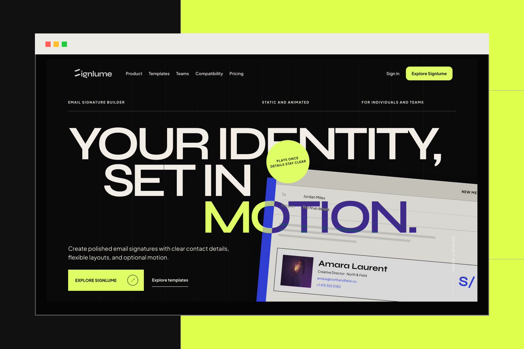
The homepage introduces the connected Lume wordmark and the design, publish, and install workflow.
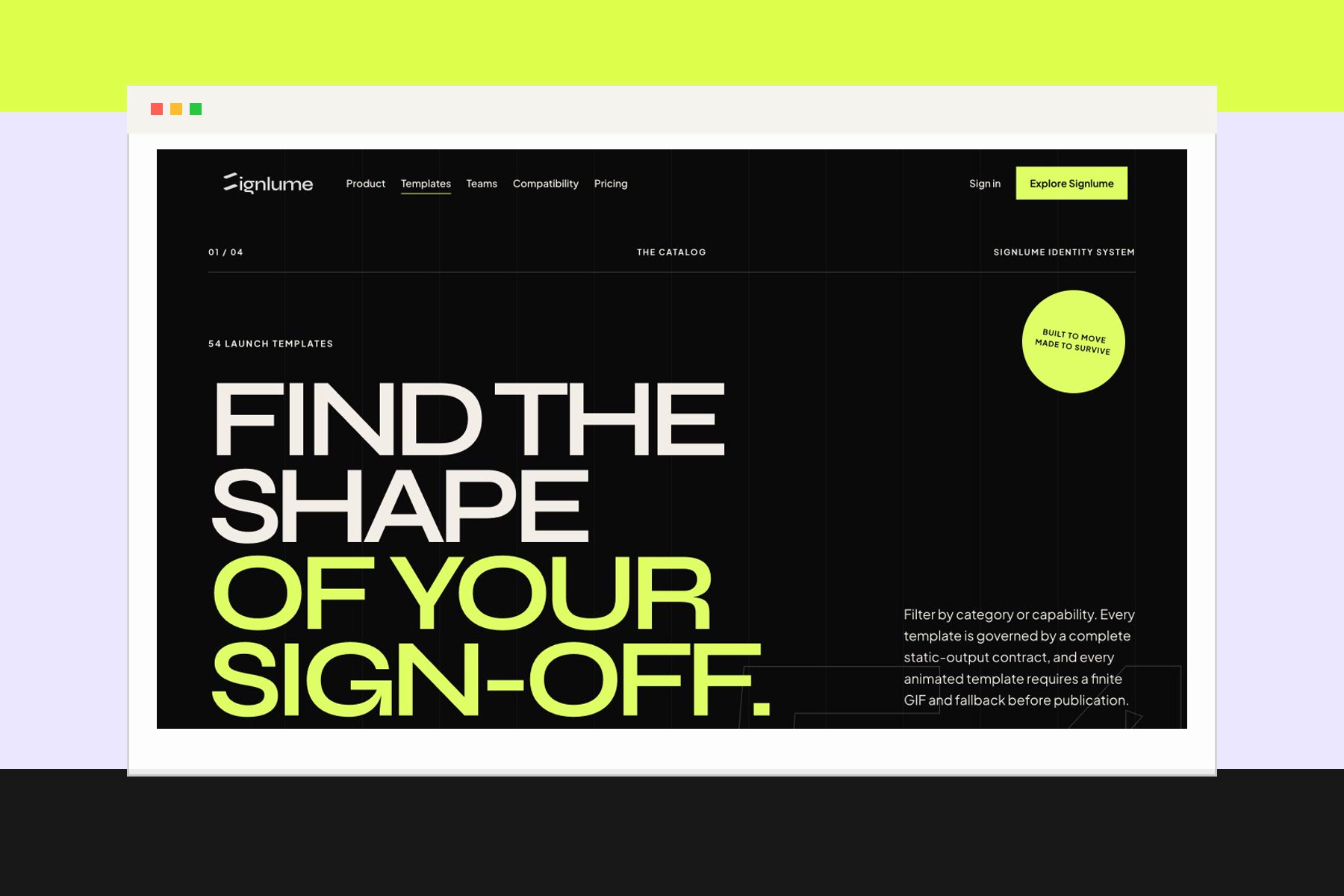
The catalogue presents template choice as a design decision, with strong previews and clear context.
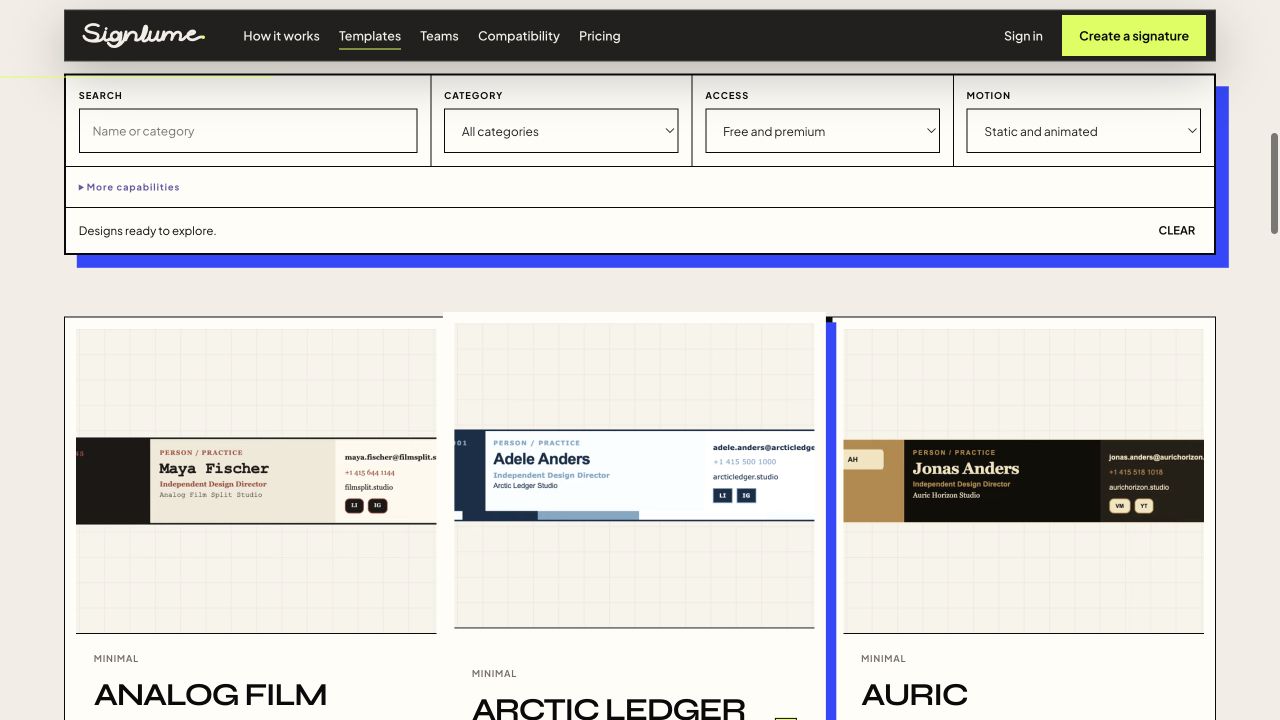
Search, category, access, and motion filters make the large template library easier to explore.
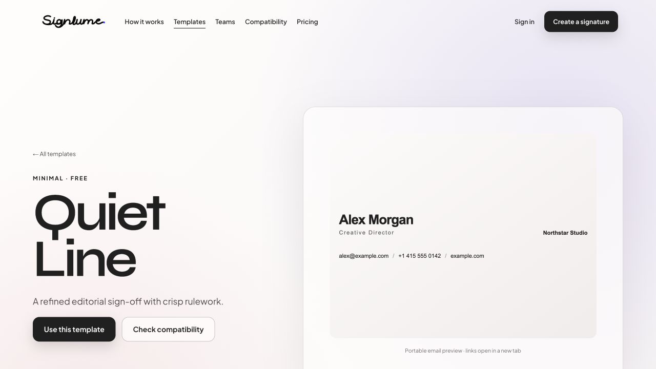
Quiet Line shows how a restrained signature can keep contact details readable, linked, and easy to use.
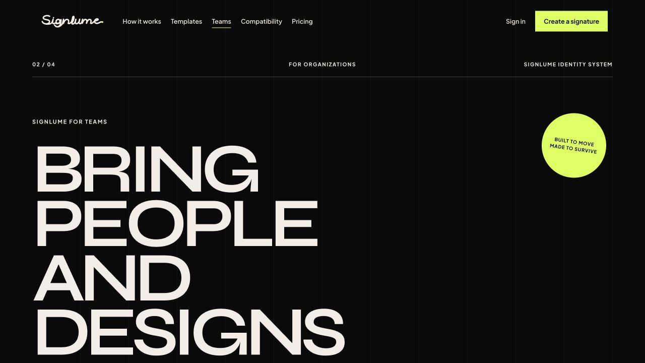
The teams page brings shared brand direction, people, roles, reusable designs, and publishing into one view.
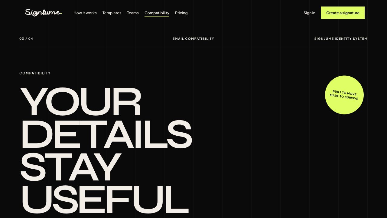
The compatibility page shows what can change in narrow layouts, dark mode, blocked images, and different email clients.
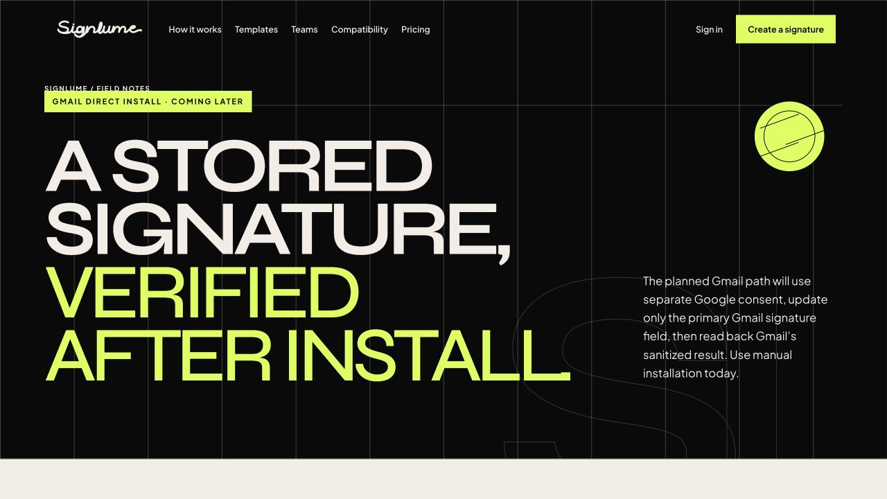
The Gmail guide is clear about what works today: manual installation followed by a real test email.
Signlume now connects template choice, visual editing, image preparation, compatibility review, publishing, installation, version history, team controls, and reporting in one flow.
Creative layouts still respect email limits, catalogue updates do not rewrite old work, motion never replaces meaning, and reporting stays clear about what the numbers mean.
What we delivered
Start a project
Share the product, the current stage, and the support you need. We will reply with practical next steps.
Start a project